2016 vs. 2020 Models
Introduction
A lot has changed between 2016 and 2020. For one, there’s the pandemic and quarantine. For another, we’ve had a different president for the past four years. What remains consistent, however, is Iowa and Ohio’s status as battleground states. In Fresh Polls of Blair, the 2016 election model that our upperclassmen made four years ago, the odds changed dramatically for battleground states, with Trump pulling ahead in the end for both states, but the odds fluctuated quite a bit beforehand. Here, we’ll compare the 2016 election model to Oracle of Blair, our new model for this year’s upcoming election, and try to figure out why exactly the odds changed so much.
Methodology
The 2016 model only looked at the 13 battleground states, which to be fair, are the most interesting. For individual states, the model weighted polls by their times of polling and sample sizes. For example, polls that were taken at an earlier date were weighted less than polls that were taken closer to the election day. Similarly, polls with smaller sample sizes were weighted less than those with larger ones. In its national simulation, the model randomly drew from state level distributions, taking into account the appropriate correlations. After a winner from a state was selected, the number of electoral votes was predicted for that candidate. The grand winner of the simulation was whoever got the most number of predicted electoral votes. While the model did not disclose any specific formulas in the program, it gave us enough information to make the appropriate analysis (i.e. graphs).
The 2020 model was a bit more complex, and spanned over all states in the US. The calculations started with the Blair Partisan Index (BPI), the weighted average of differences in previous presidential elections. Similarly, an equation for Trump’s predicted win was derived, weighting factors such as race, religion, education, and community. That analysis was then averaged with the BPI to combine the two. To average the polls, the model used a z-test while also factoring in variance where appropriate. It combined that with the BPI to create the “state lean.” In its national simulation, the model used a specific correlation scheme that included the state lean, a combination of all the previous factors we’ve mentioned in this paragraph.
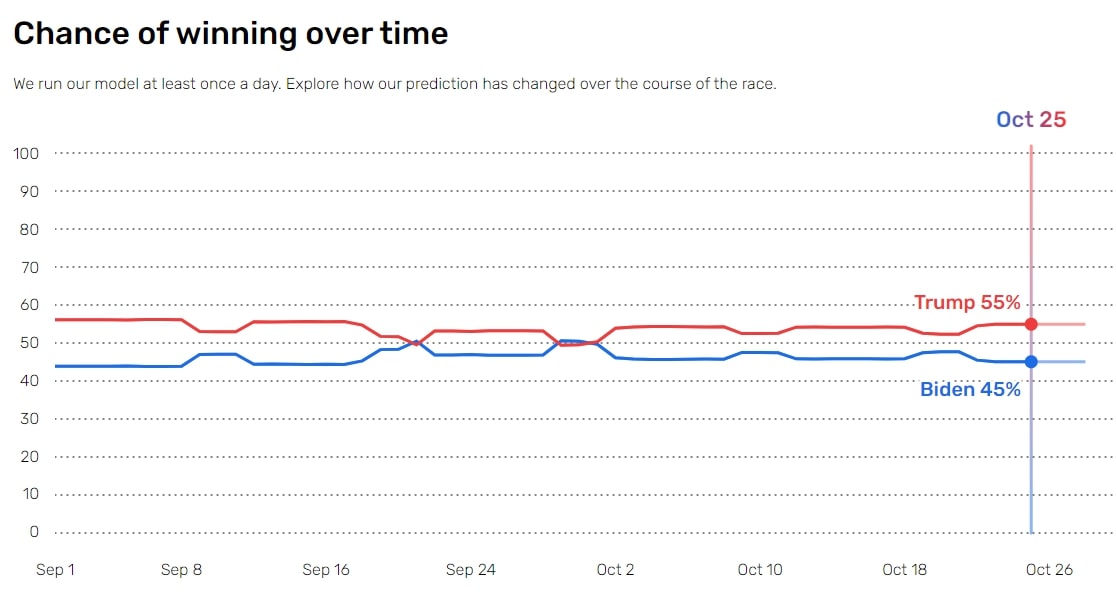
For this blog, we specifically looked at the graphs provided for Ohio and Iowa, two battleground states that have fluctuated vigorously between the two parties in both elections. Unlike the 2020 model, which included data points and tangible values, the 2016 predictions only offered us general graphs with almost no specific numbers (aside from the ending predictions). Therefore, to make the analysis balanced, we mainly took into account the overarching shape of the curves and drew conclusions from there.
Analysis and Discussion
There are some limitations on the comparisons that we can make from the two models. As we are currently going into the 2020 election, we don’t have the actual win percentages, meaning that the predictions are subject to change everyday upon the addition of newer polls. Given that we don’t have future election data, we decided to look at past data from the 2016 election as well. As of writing this, we are 9 days away from the election. To make this balanced, we looked at the same time frame from the 2016 election.
One big difference in the graphs is the change in shape. The win percentages of Ohio in 2016 started out relatively close but branched out as Clinton peaked at around 75% 28 days before the election and then slowly came closer together as they were nearly 50%-50% 9 days before the election. At the end however, Trump pulled ahead and took the state.

The shape of Ohio’s graph in 2020 is similar in that it starts off with Trump peaking at around 55% and the percentages later coming closer together, but one change is that this pattern is repeated around every 10 days, with Trump consistently staying above Biden. Our graph currently predicts that Trump will win 55% of the time.

The graph of the win percentages in Iowa of 2016 is very interesting, as it started off with Trump at 75% 28 days before the election, but then the lines cross and the predicted winners change 4 times. There were 2 intervals at which Biden is predicted to win, but these intervals are rather short. 7 days before the election, Trump was predicted to win a little more than 50% of the time.

In comparison, the graph of Iowa in 2020 starts off in a similar manner, where Trump is predicted to win 80% of the time. However, the graph is different in that it is stable with only a slight dip up until 39 days before the election, where it drops to 60%. At 31 days before the election, it drops again to 53% and continues to stay relatively close to that prediction with a slight dip to 52%, followed by a return to our current prediction 9 days before the election that Trump wins 54% of the time.
Many factors in the 2020 election are still foggy, with the increasing importance of mail-in and absentee ballots. Currently, the mood is changing as well, with Trump’s response to the COVID-19 pandemic and the American situation as a whole. In addition, mail-in ballots have also caused controversy with President Trump, who, according to the New York Times, equate those ballots to “a fraudulent election.” However, the democratic party has been actively pushing for postal ballots.
Another factor of consideration is the UPS system and the means of delivering ballots. According to the New York Times, over 100,000 voters in New York received envelopes that belonged to someone else, pointing fingers towards a clear issue in the system. The policies surrounding mail-ins have also faced backlash, with over 2,200 rejected ballots in the Michigan primary due to a missing signature from the voter. With the ups and downs of mail-in ballots, there will definitely be some fluctuations or changes in the results that may be unpredicted.
However, another difference between the 2020 and 2016 elections is a potentially higher voter turnout. With the influence of social media and promotions of mail-in ballots, people have learned their lessons from the previous presidential election. According to Nature, in the typical setting, only 60% of eligible voters participate, with potential turn-offs being long lines or no time. However, after conducting a postal experiment, researchers found states that included postal ballots had a significant increase in voter turnout, ranging anywhere from 1.8% to 9.4%, maybe even higher.
References
How Could Voting by Mail Affect the Election? Look at Michigan. (2020, October 11). Retrieved from https://www.nytimes.com/2020/10/11/us/elections/vote-by-mail-election.html
Peeples, L. (2020, October 23). COVID and the US election: Will the rise of mail-in voting affect the result? Retrieved from https://www.nature.com/articles/d41586-020-02979-x