The Variance Problem
Introduction
Throughout the process of making our model, we had to choose what variables to incorporate and how much weight we should give to each of them. However, the most important decisions came down to how we accounted for the variance of polls within each state (state variance) and how we correlated each state to the other when running simulations
First, a quick summary of how our model currently does both of these things. Variance (and in turn standard deviation) for each poll in our model was based on raw sampling variance based on the amount of poll respondents and the amount of undecided voters in the poll. Variance was added to each state based on the Cost of Voting Index (CoVI) and the amount of days before election day.
To correlate states in our model, we used the Adding After the Fact (AAF) method, which consisted of creating a correlation matrix for each state comparing it to every other state, and then applying random shifts based on the state variance and shifting demographically similar states in that direction. Thus, for example, if Trump were to win Pennsylvania, the demographically similar states of Michigan and Wisconsin would also be shifted in Trump’s direction, representing a swing in the mood of voters in those particular states. This is done for every single state, and thus we have a web of interconnected states shifting randomly and having each shift tug the other. A more detailed explanation of our methodology can be found on our methodology page.
The mean vote share for each state and the predicted win percentage for each candidate are in line with other professional models. However, our decision to create the model this way led to a number of issues
To start off, [the authors of this post feel that] our model simply has too much state by state variance. Granted, this can be somewhat subjective, based on one’s perspective of the presidential race, the factors chosen for variance, and how those factors are applied. However, there is a point after which outputs, without very solid explanation, become problematic. In our model, that point is reached.
Take Illinois and Rhode Island, states that voted for democratic statewide candidates by double digits for over 30 years, and are considered safe Biden states by professional models and pundits alike. Yet, in our model, Trump has a nontrivial chance of winning both of them (12% as of October 15). It would seem our model thinks Trump is in a great position, right? Wrong. Looking at deep red Nebraska and Mississippi, we see that Biden has a feasible chance of winning (13 and 17% respectively as of October 15). Overestimating unlikely scenarios like these can be attributed to a high variance, because widening the distribution of a state whose center is far from zero increases the percentage of that distribution where the underdog is expected to win. The vast majority of this variance comes from two factors: CoVI and days before the election. While we fully agree with the decision to implement these factors, we think they have too much of an impact on the model, causing them to both overshadow other factors and show noncompetitive states as closer than they are.
An astute reader might be wondering, if our model has such high variance, doesn’t that mean we should be giving a good shot to Trump, the current underdog? The answer to that question is yes, but we clearly aren’t; Biden had a 90%1 chance of winning on October 15th, and that has only increased. That’s where state correlation (AAF) comes in. In AAF, there are a total of 522 races affecting each individual state. Those numbers, when chosen randomly from a normal distribution, are likely to cancel out and lead to a less extreme shift overall. Similarly related states will be shifted in a similar manner, but, and this is key, because the shifts are chosen randomly, the values that individual states shift each other by are independant.
These factors end up canceling each other out to an extent. High state by state variance increases the variance of the national prediction (and thereby Trump’s chances), and undersized shifts between correlated states decreases it. But that’s….not good. Not only is it bad science, but it also leads to some unrealistic results. Due to the fact that much of the variance comes from CoVI, and to a lesser extent, other statewide factors, our model treats state elections as mostly independent of one another3, so any simulation where Trump wins could be the result of something crazy like him winning New Jersey, rather than a more logical scenario where he does unexpectedly well in the midwest and takes down the blue wall yet again. In essence, solving this problem would involve increasing state correlation while decreasing state-by-state variance. In the following paragraphs, we’ll outline our plan to do exactly that.
It’s clear that the two issues that affect our model — state variance and AAF — are intertwined, and must be addressed together. First, we will be addressing our state correlation scheme, AAF. As mentioned earlier, the core of the issue with this scheme is that the random shifts applied to each state are applied independently of one another, and thus leads to a substantial amount of cancellation. When looking at the model on October 15th, using no correlation scheme gives Biden a 96% chance of winning, while using AAF gives him 90% chance. Any scheme that increases the correlation between the states is going to favor the underdog more, as a race with no state variance and correlation is going to give the current leader an 100% chance of winning every time, and one with an infinite state variance and large state shifts will be a perfect coinflip (50%).
Seeding Simulations
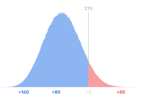
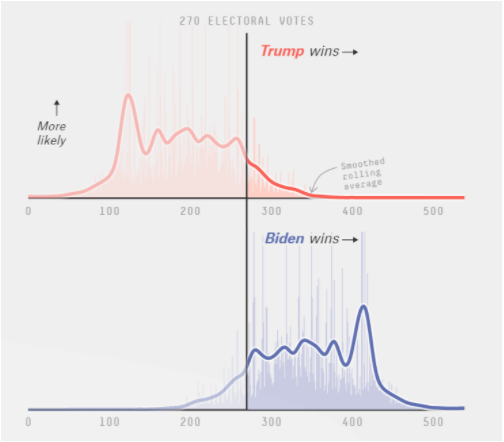
Our proposed model, Seeding Simulations (SeeS), would fix this. Instead of drawing numbers from 53 different normal distributions independently, SeeS picks one state to be the “seed,” generating a shift for that state based on its variance. That shift is then run through a correlation matrix and applied to each other state, shifting all states in the direction of the seed, with more similar states getting shifted more. Thus, if Pennsylvania is shifted towards Trump, we may see sizable gains for him in the similar states of Michigan and Wisconsin, but marginal ones in a state that’s more different, such as New Mexico or Florida. Because only a single normal distribution is being created, there is more variance in the amount of state to state correlation, making upset wins more likely. Additionally, scenarios such as a Trump victory in the rust belt or a Biden sunbelt sweep can be modeled if a state from one of these areas is selected to be the seed and has a large shift in the appropriate direction. This can be seen in the histogram of results when compared to that of a professional model (538). Our histogram is an almost perfect normal distribution, which is what we would expect if each race was independent, while the 538 model has different lumps representing unique scenarios, such as a sunbelt sweep for Biden. The fact that our model cannot accurately represent voter swings across states is a major weakness that we need to correct. While SeeS would only pick one state for each run to shift every other state by, since we run the model a substantial (1,000,000) amount of times, each state has a nearly equal amount of simulations as the seed and thus influences the model an appropriate number of times. Even though each individual simulation might not be very accurate, over many simulations, that won’t matter. When run with October 15th data, SeeS gives Biden a 84% chance of winning, 6% less than AAF. Seeding simulations will add an appropriate amount of state correlation to our model, but in order to implement it correctly, we need to have an appropriate amount of state variance as well.

The Oracle of Blair probabilistic distribution of results. As you can see, it’s almost a perfectly normal bell curve due to the largely independent races in each state.

The 538 probabilistic distribution of results. The different lumps represent different likely scenarios, such as a Biden sunbelt sweep or Trump holding on to the rustbelt.
State Variance and Design Effect
In order to lower variance, we changed the CoVI and days before election from this:
$$\frac{0.6(CoVI+2.06)}{400}$$
$$\frac{1}{1600}\sqrt{\frac{electionDate-currentDate}{7}} $$
To this:
$$(\frac{0.6(CoVI+2.06)}{400})^2$$
$$(\frac{1}{1600}\sqrt{\frac{electionDate-currentDate}{7}})^2 $$
Each equation was then multiplied by 4 and then squared4. At first glance, this seems to have done what we wanted it to do.


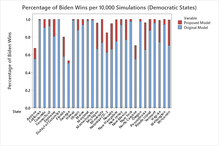
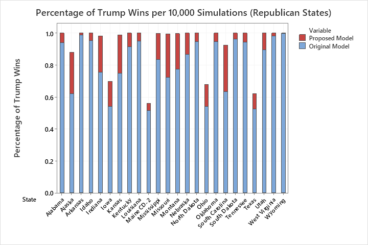
Looking at the graphs, we can see that safe blue and red states are skewed towards their respective favored candidates. Illinois and Rhode Island are almost 100% for Biden, and the same goes for Trump in Nebraska and Mississippi. But states where one candidate is favored are now skewing too much towards their respective candidates, like Michigan, Wisconsin, and Missouri, now aren’t shown as competitive. This is a classic sign of too little variance. Even if combined with seeding simulations, this new model would still not have enough variance in the final prediction.
At this point, we were somewhat stuck. There clearly wasn’t enough variance in the model, but fiddling with the numbers to get reasonable results was exactly what we wanted to avoid. Thankfully, a little research showed us the problem lay elsewhere in our model, in ignoring a factor called design effect.
In a margin of error, the design effect is a factor that accounts for the survey’s deviation from a simple random sample. The design effect takes into account the sampling method and potential decreases in accuracy due to sample demographics, design, and weighting procedures. According to the Washington Post, “Surveys that do not incorporate a design effect overstate their precision.” Our model only takes into account the sampling variation of each poll (and not potential design effect variations), meaning that after we tweak the CoVI and days before the election equations, our variance comes out far too low.
Here is an example showing the importance of design effect, using the Washington Post Virginia survey from Oct 13-19.
| Unweighted Sample Size | Error Margin | |
|---|---|---|
| Virginia RV | 1001 | +/- 3.5 |
| Virginia LV | 908 | +/- 4 |
Two-Party Vote:
| Candidate | Two-Party Percentage |
|---|---|
| Trump | 44.08 |
| Biden | 55.91 |
In the error margins, the design effect is 1.4 of the error margin for the survey. Our model variance equation with sampling variance only (no design effect):
$$ varianceCombined = \frac{pq}{n} + (\frac{1}{30} * (1 - (PercentTrump + PercentBiden)))^2 $$
It is clearly shown that the sampling variance doesn’t account for all of the variance in the margin of error. The standard deviation of this poll due to sampling variance is sqrt(pq/n) or 1.53% (for likely voters. The magnitude of the error margin in most polls (including the Post) is 1.96*the standard deviation. When plugging in 1.53 for the standard deviation, we get a margin of error of 3%, rather than the 4% we see in the poll. Because there are many ways to calculate design effect, and because many pollsters aren’t very transparent about their methods, we propose that we work backwards using the process above and the final value each poll gives us for the margin of error. For example, if a poll had a margin of error of 5%, we would divide that result by 1.96 for a standard deviation of 2.55% and then square that value before adding the %undecided vote to get the final variance of the poll. We would then tack on the lowered CoVI and days before election equations to each states’ final variance.
Conclusion
While neither of these fixes are magic cures for our models flaws, and they certainly aren’t perfect, they are easy to implement solutions that would all but remove the two biggest flaws in our model.
References
Washington Post. (2020, October 26). Oct. 13-19, 2020, Washington Post-Schar School poll of Virginia voters. Retrieved October 30, 2020, from https://www.washingtonpost.com/context/oct-13-19-2020-washington-post-schar-school-poll-of-virginia-voters/2be60bb5-dff2-4440-a7c4-af4e42a86c88/?tid=a_inl_manual
Mercer, A. (2020, May 30). Understanding the margin of error in election polls. Retrieved October 30, 2020, from https://www.pewresearch.org/fact-tank/2016/09/08/understanding-the-margin-of-error-in-election-polls/
Johnson, K. (2020, May 05). Political Polling Precision Differences: Survey Sampling vs. Attribute Sampling. Retrieved October 30, 2020, from https://auditdataanalytics.net/political-polling-precision-differences-survey-sampling-vs-attribute-sampling/
-
Referring to Trump as having a “good shot” is not to be compared with Trump’s “nontrivial chance” of winning Rhode Island and Illinois. To be clear, Trump’s chances of winning reelection are much higher than his chances of winning either of these states ↩
-
Remember, there are a total of 53 “states”: the 50 states + DC and the two competitive districts. So each “state” is being affected by 52 others ↩
-
Key word mostly. As stated before, our model does include state correlation, making it an improvement over 2016. It just isn’t as much of a factor as it should be. ↩
-
Everything under the square is less than 1, so the square does decrease the final output ↩
